This is one of a number of pieces covering events at the Edinburgh International Book Festival, which runs from 10th – 26th August 2013 at Charlotte Square Gardens, Edinburgh.
by Rebecca DeWald
“Maps are not just the domain of geographers,” says Jerry Brotton at the beginning of his talk to present his book A History of the World in Twelve Maps, which takes the shape of a fascinating journey through the history of maps. Here is a quick overview, a few facts, quotes, and things to ponder about when it comes to maps because – don’t we all just love maps?
Firstly we ponder, “Is that a map?” as Brotton introduces us to the first world map, made in Babylonia in 750 B.C. It is in fact a clay tablet representing the Earth as a disk, encircled by the “Bitter Sea” with Babel at the centre, everything else being marginal and of marginal importance.
“It has only been very recently that maps are about getting you from A to B.”
In fact, maps are about representing a world view rather than the world itself, so we should think of
“A map [as] a way of abstracting the reality you see out there.”
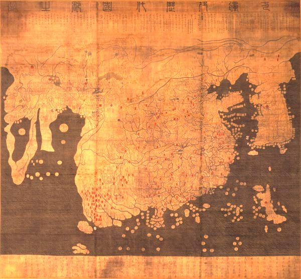
We can see that in the fact that maps depict different parts of the world at their centre and are oriented with different directions at the top and bottom. Only some maps show the North at the top, like in a Korean map from 1402, the Kangnido, which derives from the belief that the emperor would always look South, therefore the people would have to look up to him, hence North.
Many Islamic maps – like the ones by Ibn Hawqal – often show the South at the top, as a direct result of the Islamization of many African and Arabic countries beginning in the 7th century, most of which were geographically north of Mecca and therefore facing south to find their centre. An updated form are Qibla maps, which can be used in order to find out which way Mecca lies depending on one’s current geographical location.
Another famous example is the Hereford Mappa Mundi which portrays the East at the top and shows that
“Maps for most of our history have been about imagination”
In this case, the map is about Biblical stories and what lies beyond the world: Beyond the frame on the top end of the map is a depiction of Christ with angels leading the good to heaven, and the bad to hell – “a map about judgment.”

Maps display the urge “to get beyond it, outside space” and inform the imagination and the impossible. Columbus, for example, was inspired by the first globe, designed by Martin Behaim between 1491 and 1493, to find a passage to India going West. Behaim called this globe his Erdapfel [“world apple,” literally] which recalls the German for eyeball, Augapfel and even literarlly represents a particular view of the world – also since Behaim’s globes never included America.
The first map to show America as a separate continent was designed by Martin Waldseemüller in 1507 and is the attempt to stretch the 3D world out onto a 2D page, almost in the way we are used to, and thereby shows the problem of turning a globe into a flat shape.
What this map exemplifies, then, is also the arbitrariness of representing the world, partly because of what is put at the centre of the map, but also because of the size in which countries and areas are displayed. We generally use Mercator maps nowadays, stretched out to make them fit onto a rectangular sheet. The realisation of this arbitrariness, Brotton explained further, is what inspired the German socialist Arno Peters to create the equal area projection map, for which he measured the land mass and portrayed it in relation. While the Peters map – also known as Gall-Peters projection – is often used as an alternative to the Mercator map, since it is seen as a more democratic way of displaying geography, it is still, as Brotton warns, a projection – and still condenses North and South Pole at the margins of the page.
![Waldseemüller Map, 1507 [Wikipedia Commons]](http://thegrb.files.wordpress.com/2013/08/waldseemuller_map_2.jpg?w=300&resize=300%2C165)
The discussion finally arrives at contemporary maps in the form of Google Earth and Apple maps, and Brotton is strict about his warnings:
“The agenda of those maps is very explicit. Google did not get into maps to show a particular, beautiful image of our world. They got into it for particular business reasons.”
The contrast between online maps and the traditional ordinance survey maps – who have their origin in the French Revolution, much like ordinance survey was introduced in England during the Jacobite Revolution in order to understand the geography of Scotland – is the difference between public and private, objective and peer-reviewed or “democratic.” While ordinance survey maps are produced by geographers, everybody can contribute to Google Earth which, on the surface, makes these maps more democratic, but
“What about the millions of people who can’t [contribute], who are offline. Who has the option to opt in or opt out of maps?”
Brotton gives the example of some South African townships, from his time in the country, which are not on the map because there is no interest in mapping them – “maps always come with their agenda.”
He concludes by presenting his current art project: Together with the artist Adam Lowe he is constructing a three-dimensional map of the world for the Venice Biennale 2015 on a disused football pitch on the Isle of San Giorgio Maggiore: “It is an environmental statement but it is also about the wonder of the world that we have lost with the online world.” Not only do maps represent subjectively, this subjectivity is inherent in their production, as every grand map needs a benefactor. The map project for the Biennale makes no exception, so Brotton and Lowe decided, rather than looking for sponsors, to crowdsource it, since a map itself
“is never right or wrong, good or bad, right-wing or left-wing. It’s about how you use it.”
Leave a Reply